
We all love an underdog story and the 2019 Stanley Cup Final between the St. Louis Blues and the Boston Bruins gave us one for the ages. The Stanley cup is contested between Canadian and American teams and represents the elite level of the sport of ice-hockey.
The Boston Bruins, one of the founding members of the NHL, were searching for their seventh cup victory and first since 2011. Indeed, many of the players from that 2011 victory were still around. They knew what it took to win and the odds were stacked in their favour. For the best of seven game final, they held home ice advantage (meaning the first two crucial games were played in Boston, as well as the final game seven if needed). In addition, they boasted the NHL’s most feared attacking line. The so called “perfection line” consisting of David Pastrnak, Brad Marchand and Patrice Bergeron who scored 106 goals between them in the 2018-19 season.
The St. Louis Blues on the other hand were making just their fourth appearance in the final, seeking their first ever win (being the oldest franchise not to have won the Cup). They began the year with the worst record in the league and there was nothing to suggest they could turn their season around, let alone go all the way to the final.
Not only did St. Louis Blues get to the final, they went on to claim their first Stanley Cup. So what happened? How exactly did the Bruins lose? This question is of course one that is often asked when the favourites fail. How did they fail? Sports fans and casual viewers alike rarely give the underdog the credit they deserve. This is because the difference between winning and losing is often subtle and lost among the superlative of phrases such as “perfection line”.
There are ways however to remove the hype and emotional framing of such outcomes – and one of those is to look at the cold hard facts generated by the data from the sports we love. Sports generates innumerable datapoints – every event is counted and assigned attributes. We can take a high level view of millions of events and look at the patterns to help us form more compelling narratives and ask more intelligent questions.
It can be easy to say things like “the Bruins never showed up” or “they just didn’t get going” – and while those things can be true and feel intrinsically right to us, what’s more difficult to conclude on is the why?
In ice-hockey, a popular narrative is that goal keepers and defence men are often key and this is reflected in the individual prizes including prestigious individual awards for best goal-keepers. Contrast this with Soccer who has not awarded the top individual award to a goalkeeper since 1963.
With this in mind, it is our belief that St. Louis were able to upset the odds by better utilising their defence men in offensive play. Using data, we aim to highlight key differences in the style of defensive players between the two finalist, and how St. Louis utilized this form of attack to their advantage.
Attack is the best form of Defence
So how are goals scored in ice-hockey? To help us understand this, lets take a look at all shot and goal events from the 2018/19 and visualise them on a heatmap. During the course of a game there can be hundreds of different event types and many of these are measurable. These events can range from the time an individual player spends on the ice, his average position while on it, right down to the co-ordinates of every pass, shot, goal and assist.
By filtering out just the shooting and scoring events, some interesting patterns begin to emerge. Let’s take a look at the season in question – 2018/19
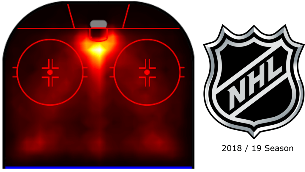
Fig. 1 – The shots and goals from the entire 2018/19 NHL Season
Areas of higher intensity colour intuitively represent those areas on the ice where more goals and shots are taken from. This heatmap may appear particularly intuitive, even if you have only ever seen an ice-hockey game for more than a minute. More shots and goals from close in.
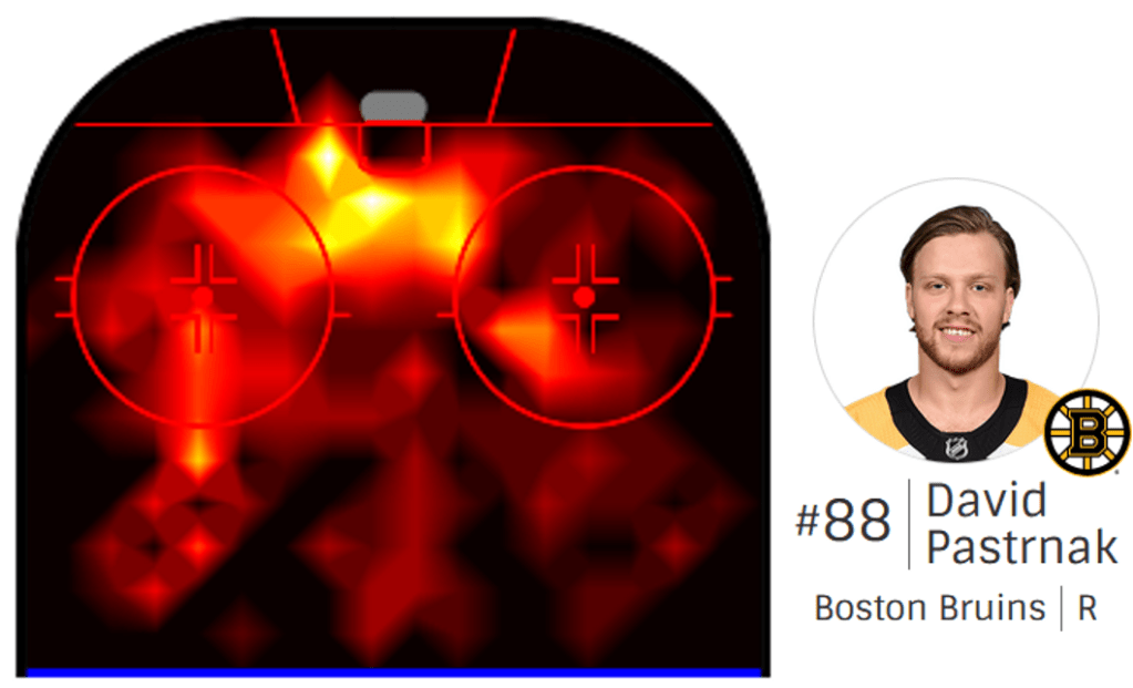
Fig. 1a – The shots and goals by David Pastrnak – one of the best attacking players in the league
Unsurprisingly – attacking players such as Pastrnak tend to profit in the same areas. Pastrnak here favours the the left hand side of the ice. However there are subtleties in this heatmap and we believe they reveal the key to the Blues success.
Before we dive in, let’s look at the map in a bit more detail and see what is going on
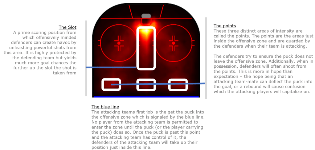
Fig. 2 – An Overview of the key shooting and scoring positions
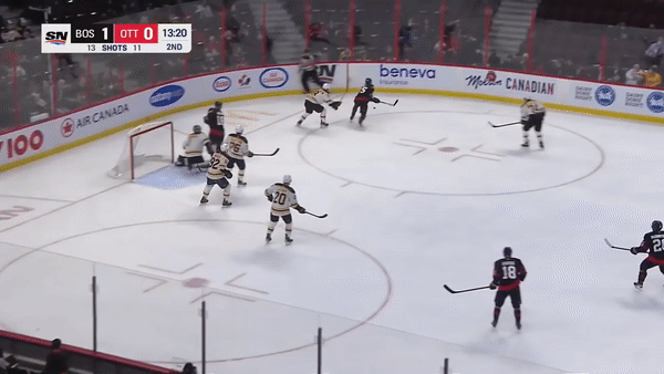
Fig. 3 – A classic shot from the point by a defender leading to a goal
In this clip, we see a typical low-percentage play by a defence man. As the puck is passed from the attacker, back toward the blue line, we see both defence men taking up their positions on the points. The defender hits it hard and low to create confusion and hopes the puck will fall favourably for an attacking team mate. In this case it does and the attacking team capitalise.
So just hit the points then?
Defenders appear to have an easy time of it. Guard the points, send the puck in and see what happens. These types of plays however are low percentage and somewhat easier to defend against.
The most dangerous defence men are those who can leave the point behind them, creating even more uncertainty for the defending team. Leaving the point exposed has its price however. If the attacking team loses control of the puck, an unguarded point can lead to highly dangerous counter attacks. The best defence men are aware of the risks and know when to leave the point.
Back to the final
So do St. Louis really have the more dangerous defence men? By filtering the data on their respective individuals in both teams defence, we can recreate the heatmaps above and see what these players do at the respective areas of the ice.
First, the Boston Bruins
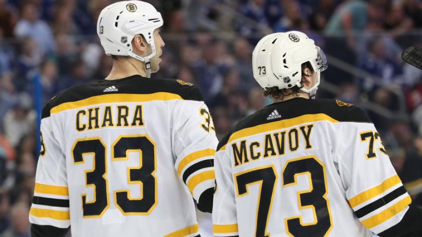
Fig. 4 – The Defence men for the Boston Bruins
The main defensive paring for the Boston Bruins during the final was Zdeno Chara from Slovakia and Charlie McAvoy of the USA. Let’s take a look at their aggregated heat map for shots and goals.
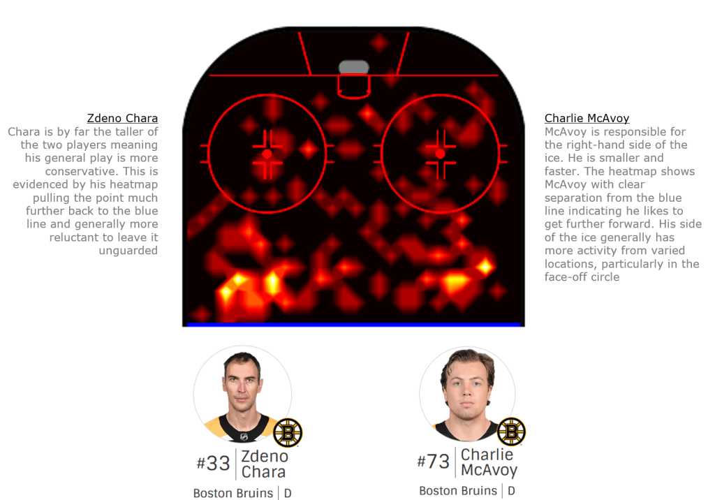
Fig. 5 – Bruins defensive pair heatmap
Compared to the aggregated heatmap for the league, we see the points clearly defined here. McAvoy seems prepared to take risks, and act further inside the blue line. His line mate Chara however almost appears to have one skate planted to that blue line. On the surface, this would appear to be a good strategy.
Secondly, the St. Louis Blues

Fig. 5a – The St. Louis defence men
The Blues defensive pairing consisted of the St. Louis Blues captain, Alex Pietrangelo in addition to Joel Edmunson, both of Canada. How does their heatmap compare?
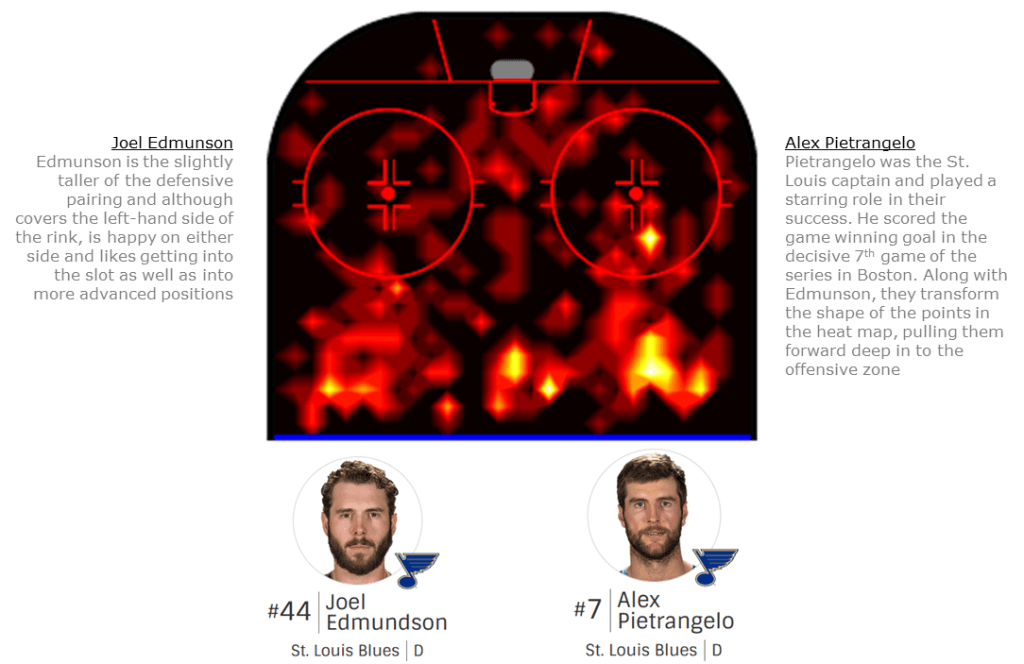
Fig. 6 – The St. Louis defensive pair heatmap
The St. Louis Blues defense men redefine the shape of the points. They appear almost arrow like pointing the way forward into the offensive zone. In addition, they both have a clearly defined third point at the top of the slot. Indeed, the slot itself shows much more activity from the Blues. Pietrangelo in particular made decisive contributions in the key games. Overlaying both heatmaps show’s the contrast quite clearly.
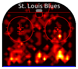
Fig. 7 – Blending the heatmaps of the defensive pairs from both teams
Heatmaps in Action
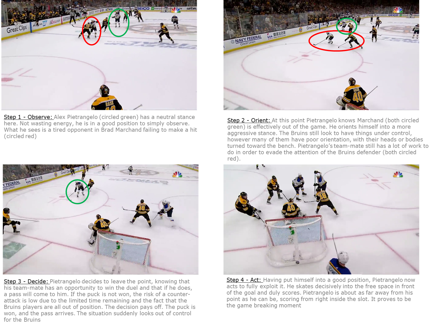
As useful as the visuals are, it helps to pick out real moments from the game to understand how these patterns emerge. To get a real sense of what is going on in the heatmap, let’s take a look at the key moment. With the final game firmly in the balance and less than thirty seconds remaining in the first period, Pietrangelo senses and delivers the game winning moment.
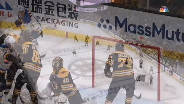
Pietrangelo knows that his opponent, Brad Marchand (circled) is tired and wants to get off the ice. This is the perfect moment for Pietrangelo to abandon the point as shown by the path of the yellow arrow. Pietrangelo rushes forward, correctly anticipating the pass and scores. Marchand on the other hand looks on in disbelief from the bench. A perfection line change that was anything but perfect.
This match up between Marchand and Pietrangelo is also interesting for another reason. Coaches have the advantage of access to visuals and analysis and can take time to make decisions regarding the team. Consequently, those decisions having took longer to make, also manifest themselves over a longer time period.
In contrast, Pietrangelos decision making on the ice is instantaneous, and has an immediate impact. Despite the high speed, there is still a process for Pietrangelo to go through. Just as a coach observes performance trends in his office, the players also need to observe and react all be it in the heat of the battle.
We can all imagine the the comfort of a coaching office. Few of us however have had the privilege of being involved at elite levels of sport and it is hard to relate. So how does the decision making process look for Alex Pietrangelo on the ice? Let’s break it down.
Conclusions
The beauty of these visualisations is that they can help us see the behaviours of certain teams and players quickly. The job of the defensive players is not that complicated compared to their attacking team-mates. Defenders typically spend more time skating backwards (using different muscle groups) and can stay on the ice for longer than attackers.
Attackers jobs are rather more complex. They expend much more energy, usually skating faster and in forward directions. They come under constant pressure taking hits from the opposition and this drains energy and quickly affects decision making. We saw this clearly with Marchand, the Bruins forward who made a poor but tired decision to make a line change with just seven seconds remaining.
For this reason, attack coaches require more advanced statistical analysis, beyond what a heat-map could provide of their forward players. Attackers generate more data and require many more relevant attributes to be measured as their energy needs to be managed more carefully. This adds up to greater complexity where statistics (although more time consuming to produce) can provide key insights.
As we have seen the defence men have relatively less complex involvements, yet still generate sufficient data points. This balance between the number of events they generate and the lower number of attributes which require measurement mean that heatmaps and visuals are a more suitable tool for defence coaches to analyse progress of their defensive players.
Ultimately, there is a certain beauty in simplicity. What Pietrangelo did was made to look easy. By looking at his data and heatmap, we can begin to understand what makes him stand out above other defence men. Then by looking at video clips and breaking them down frame by frame, we can see why he does it. Ultimately, he was also looking around, collecting data and acting on it. His ability in this regard proved to be the difference and the underdogs of St. Louis produced a famous victory.
